Accessibility is something which is within my reach. It just took me some years to use it properly.
If you are in a hurry, just go to the Accessibility Tips. If you have more time, you can start with the next paragraph. Next.
Sleight of thought
For my blog I use a default WordPress theme. I try to compensate this standard look and feel with humour. Am I kidding? No.
My first blog post was a struggle with looks. I did not like header 1. The font was too big. I just used bold to make the headers. That looked just right.
During an online computer course I had my first encounter with a screen reader. Users with bad or no view can use this program to read a web page aloud.
My trick for nice headers using bold was backfiring: a screen reader would not recognise them as headers. I really needed some header tag. So I ended up with header 6. This looked good, but it was still not right.
Just a little more
After tensome blogs I started to use the alternative text of the image.
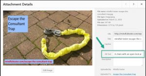
In the past this was primarily used for people with slow internet connection. This way they still could get an impression of the webpage, when the text was shown.
In another online course I learned that the screen reader could use this for the communication. Then I read a tweet about using a proper description. So “another mindmap” was not really helpful.
Now I had to compress the information in a picture in a few sentences. That was really tricky, if some graph was involved.
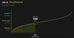
The Alt text is as follows:
“A line graph is shown with three different colours: orange for beginners, green for proficient, and blue for expert. There is a green circle “Skill IQ 135” in the green line, which is connected to a vertical line with “40th percentile” at the foot!”
Maybe you noticed the exclamation mark or ! at the end of the text. This is a trick I learned later one: the screen reader reads this text differently aloud.
I even made a blog post with a few screen reader tricks. In this particular post a screen reader user has a big advantage over a user using a normal view.
More exploration from my side
The trick with header 6 was not right. I just knew. A lot of people start counting from 1, programmers from 0. But 6 is not the right exception.
It was a matter of months that I read about a confused screen reader. So I better start from header 1. Which was not my big favourite.
On Twitter I saw a tweet of a user with a bad view complaining about bad contrast. Within minutes another blogger reacted by adjusting his website.
My turn
I did quick check of my blog. It was all black characters on a white background. Then I noticed that my quotes were vague.
Now I had to find a way to change my headers and quotes. Time to explore the Content Management System or software to maintain my blog. Mine is called WordPress.
I first focused on the desired look of my header. I opened my word processor for note taking. My goal was to have my header 1 to look like header 6.
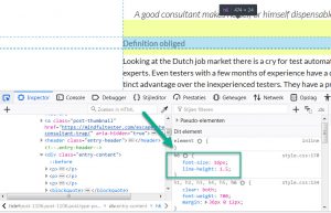
There was a nice tool in my browser: Dev Tools or Developer Tools. In my browser on my Windows machine I pressed F12, scrolled down to a header, selected the element, and saw the properties.
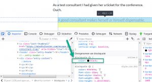
I did the same sequence for the quote. In HTML it is called blockquote. Fine with me.
The colour was grayish. I started to play with all kinds of colour codes. Until I realised that “black” was also good description for a font colour.
Dev Tools allowed me to experiment with the properties of the block quote without an intimidating program.
Easy does it.
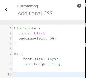
Now I had two pieces of code. Somewhere I had to fit them in. I started touring the CMS or Content Management System and found Additional CSS using the following path
Dashboard => Appearance => Customize => Additional CSS.
CSS stands for Cascading Style Sheets. Suppose I change the look of header 1 at 1 place. It will affect the look of all headers 1 in my whole blog. Cascading is cool.
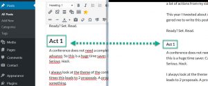
I was too early for claiming my victory. Header 1 did not change in the visual editor. I did a preview and it looked right. Okay, found something.
At the end I had changed all headers 6 to headers 1.
So I only had to modify all the headers of my remaining blog posts. Great. Extra work.
The change of colour in the block quote went smoothly. But I was not pleased with the vertical alignment of the quote. It was too close to the left margin.
On the web I discovered that margin of an object was used to place a rectangle around the quote. Another search led to padding. If I could pad the text in the quote, then it would shift to the right. Left padding was enough.
Because I had only used block quotes for quotes, all quotes in my blog were automatically modified.
Accessibility tips
- Use header to mark headers instead of making them bold.
- Add an alternative text ending with an exclamation mark to all pictures.
- Make the contrast of the colours of the text and background bigger instead of using some gray colour on a white background.
- Use Additional CSS in WordPress, if you are still not pleased with the look of the elements on the page.
- Look for other ideas on the Global Accessibility Awareness Day website. For the record it is the third Thursday of May every year.
Ending notes
- I know that there are enough readers willing to check the accessibility of my blog. The status of accessibility on my blog is in progress.
- At the moment of publishing this post there are still words in bold who look like headers in my first blog posts. There are still pictures without an alternative text and/ or exclamation mark.
- I would not be surprised that there is still work to be done after all these updates.
